
DeBreww — a cozy mobile coffee app that blends warmth with simplicity
A UX/UI design project to make coffee discovery and ordering more enjoyable for everyday drinkers.
Project Overview
DeBreww is a fictional mobile coffee app that reimagines how customers interact with local coffee shops. The goal was to design a calm, inviting digital experience that captures the warmth of a café while keeping the ordering process simple and visually pleasant.
This project was completed within 1 week to practice my design process from research to final prototype.
Role
UX/UI Designer
Duration
1 week
Tools
Figma
Team
Individual project
Methods
User interview, wireframing, prototyping, usability feedback
Problem
Many small coffee shops have outdated or cluttered digital experiences, making it difficult for users to browse or feel connected to the brand.
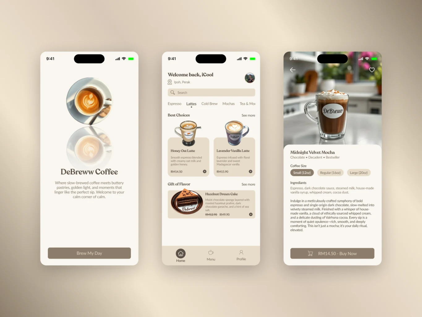
Final Designs
A snapshot of key screens from the final UI.
Highlights
- Splash Screen: Creates a strong first impression with soft tones, subtle reflections, and a welcoming tagline.
- Home Page: Displays best coffee selections, user location, and smooth category browsing for a comfortable discovery experience.
- Coffee Details Page: Features clear product information, size selection, and a straightforward “Buy Now” button for faster ordering.”.
UX Design Process
a. Research
Goal: Learn how people prefer to browse and order drinks digitally.
- Users want a simple, visual way to explore drinks.
- The first impression matters — visuals should feel cozy and modern.
- The ordering process should be quick and direct without unnecessary steps.
These findings helped me define the tone and focus: a minimal, welcoming design that highlights the coffee experience itself.
b. User Flow
I designed a short, smooth flow with only three key screens — from splash to browsing to product selection.
c. Wireframes
Before jumping into colors and details, I created quick wireframes to plan layout and spacing. I focused on large visuals for drinks, easy-to-reach action buttons and minimal text for a clean feel.
d. Prototype
Using Figma, I built an interactive prototype to visualize transitions between the splash, home, and detail screens.
e. Testing & Iteration
- “Feels easy to understand.”
- “Love the calm vibe and colors. ”
- “The Buy Now button stands out nicely.”
Based on this, I made small tweaks — like improving font contrast and refining button placement for better accessibility.
Impact
- All 3 testers completed the coffee selection process without confusion.
- Descriptions like “simple,” “inviting,” and “clean” were repeated in feedback.
- The design was perceived as “calm and elegant,” which aligned perfectly with the intended mood.
Learnings
As a beginner designer, this project helped me understand how visual tone and layout simplicity affect user experience. I learned that:
- Even small projects benefit from early user insights.
- A minimal number of screens can still create a strong experience.
- Visual warmth (color, typography, spacing) can convey emotion effectively.
If I continue...
If I continue developing DeBreww, I’d explore adding loyalty rewards, pickup options, and personalized drink recommendations.